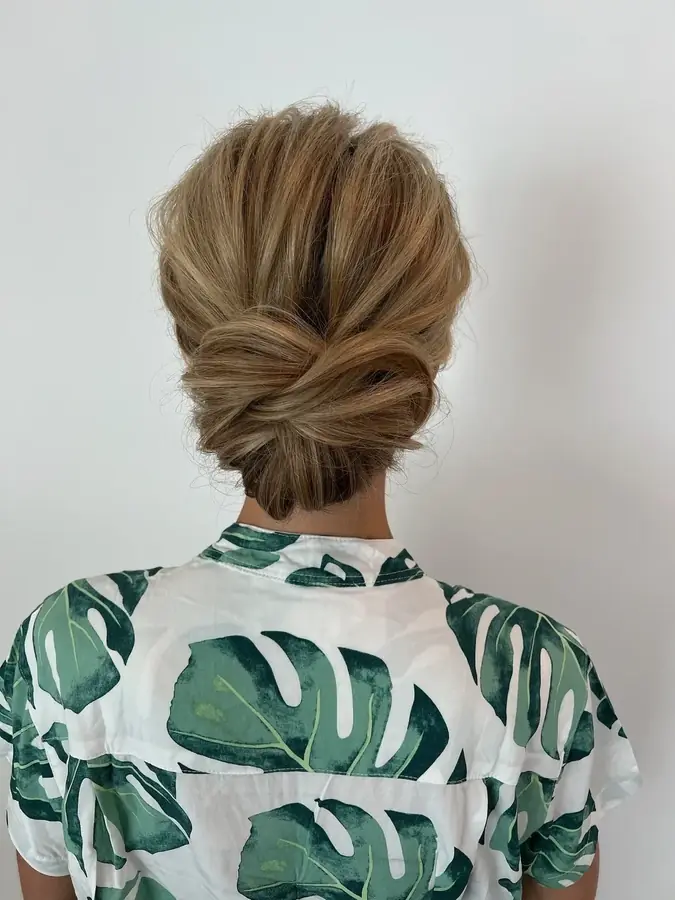
IThe Arrivalmatted plate · the overture · 0% crop
A
Est. Southwest Florida
Adorn Artistry
Preferred Vendor — Sidney & Berne Davis Art Center
The quiet luxury of the wedding morning.
Fort Myers
Naples
Sanibel
Captiva
Worldwide
Adorn Artistry — direction two
The film is gone and it should be. What replaces it has to carry a different kind of weight — not motion, but composure. The register here is old-world Naples: light ivory grounds, engraved-stationery type, gold hairlines doing the work that ornament usually does, Roman numerals, and photographs treated like framed plates on a wall rather than wallpaper behind a headline.
Three hero directions follow, each full viewport, each followed by the devices that would carry through the rest of the site.
Two corrections from your note
| Direction | Slot it was forced into | Photo cropped away |
|---|---|---|
| A — The Still | 810 × 904 from a 1147 × 1600 photo | 20–28% |
| B — The Drift | 288 × 1116 from a 1147 × 1600 photo | 66–84% |
| C — The Reveal | 209 × 324 framed portrait | 10% |
The slots were only half of it.
I also chose the wrong photographs. Measuring the library, g031 — the one I made
the hero — is roughly 72% skin tone,
meaning it is one of the tightest beauty close-ups in the whole set. Forcing that into a narrow
column is why it read as a detail rather than a photograph.
So in everything below: every plate is rendered at its own aspect ratio, whole. Measured crop is 0% at every breakpoint. And the plates favour the library's scene-setting frames over the extreme close-ups, with the tight beauty shots used deliberately, as detail — the way a magazine runs a wide establishing shot and then a close.
Est. Southwest Florida
Adorn Artistry
Preferred Vendor — Sidney & Berne Davis Art Center
Fort Myers
Naples
Sanibel
Captiva
Worldwide
Selected work
Scroll to walk the corridor →
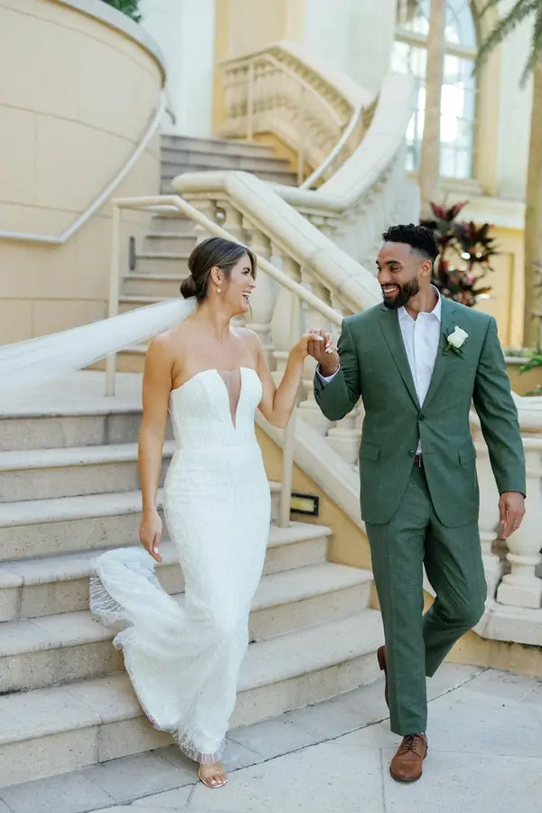
I — Descending
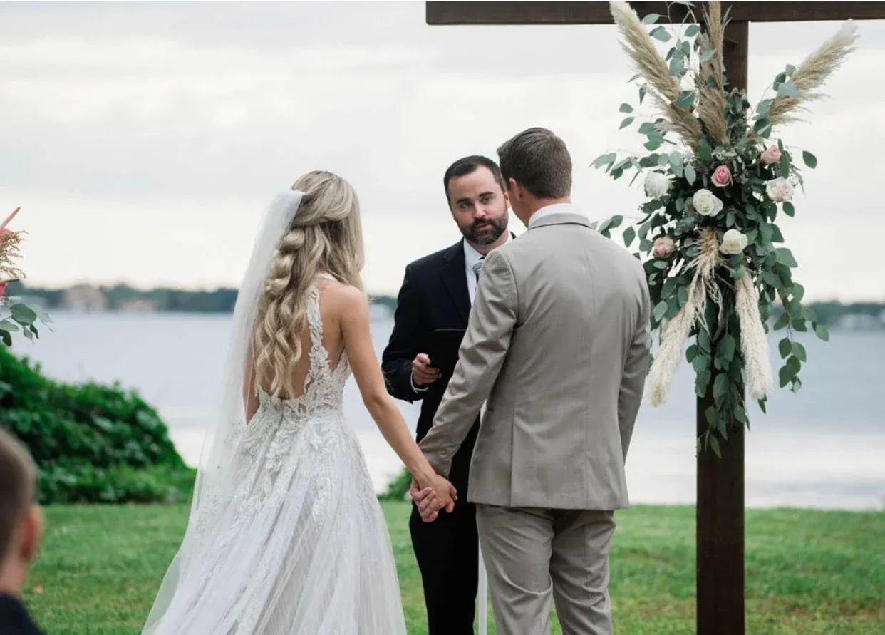
II — The morning
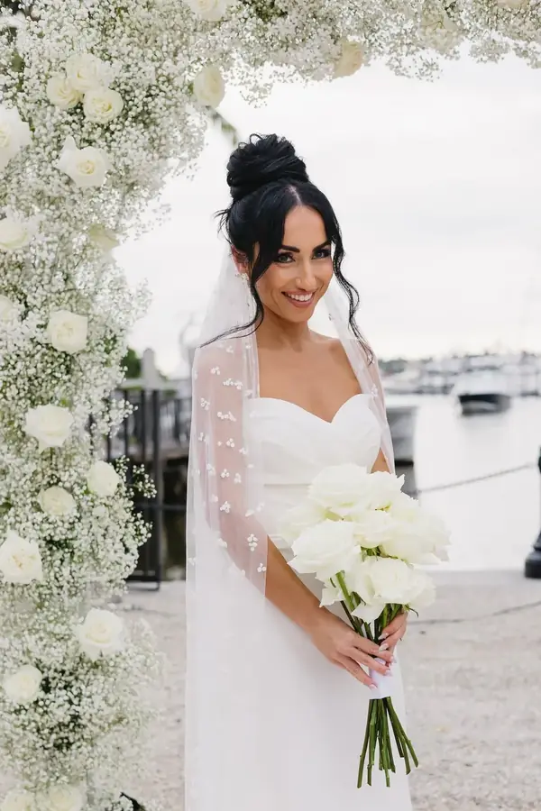
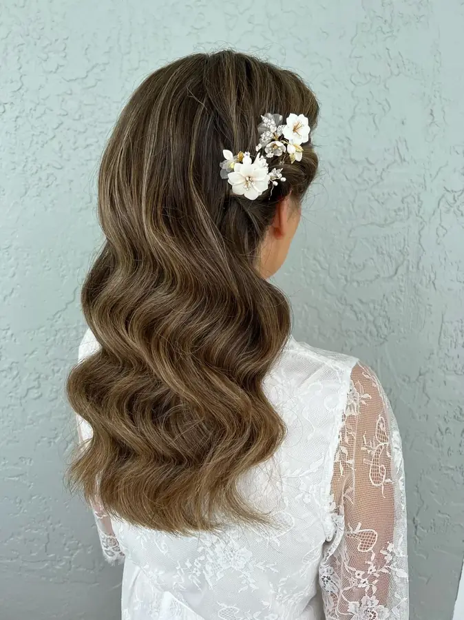
III — Detail
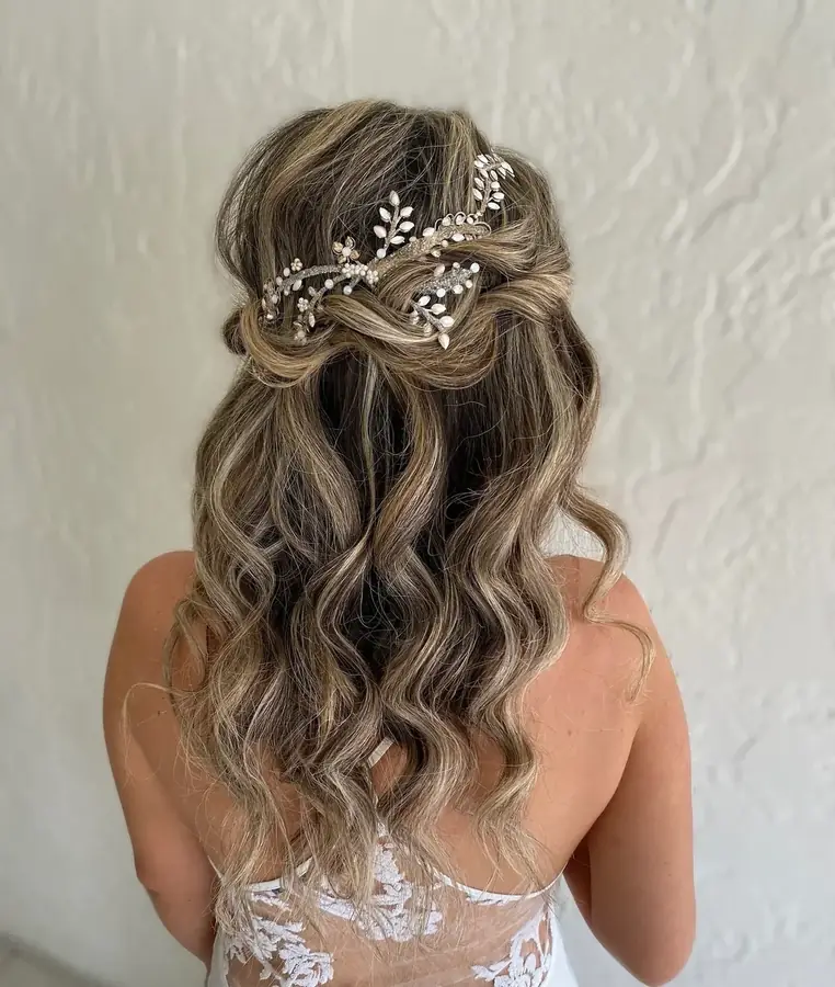
IV — The veil
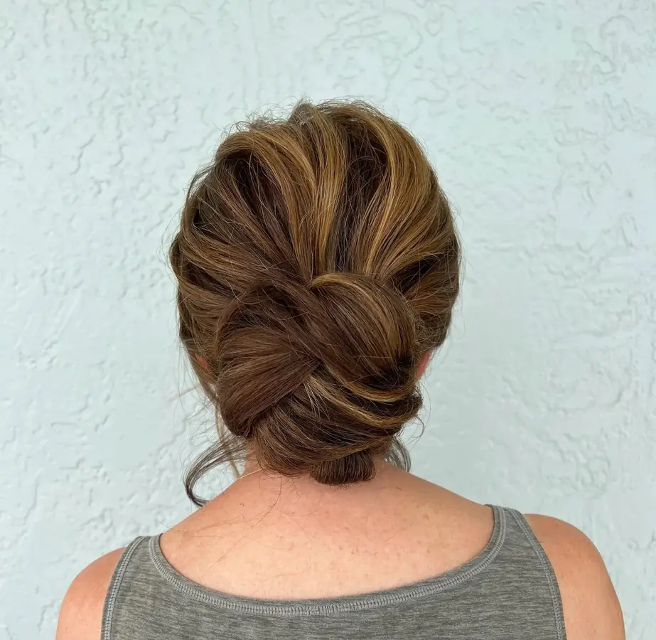
V — Studio
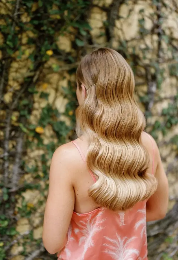
VI — Close
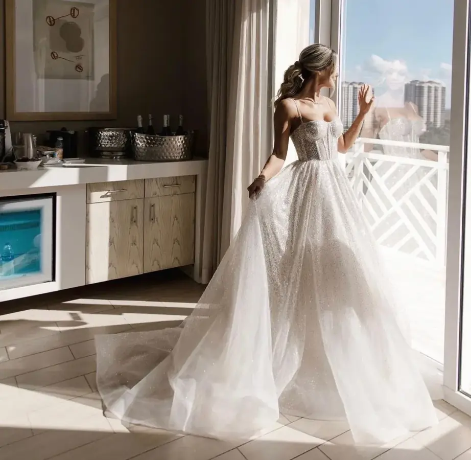
VII — Reception
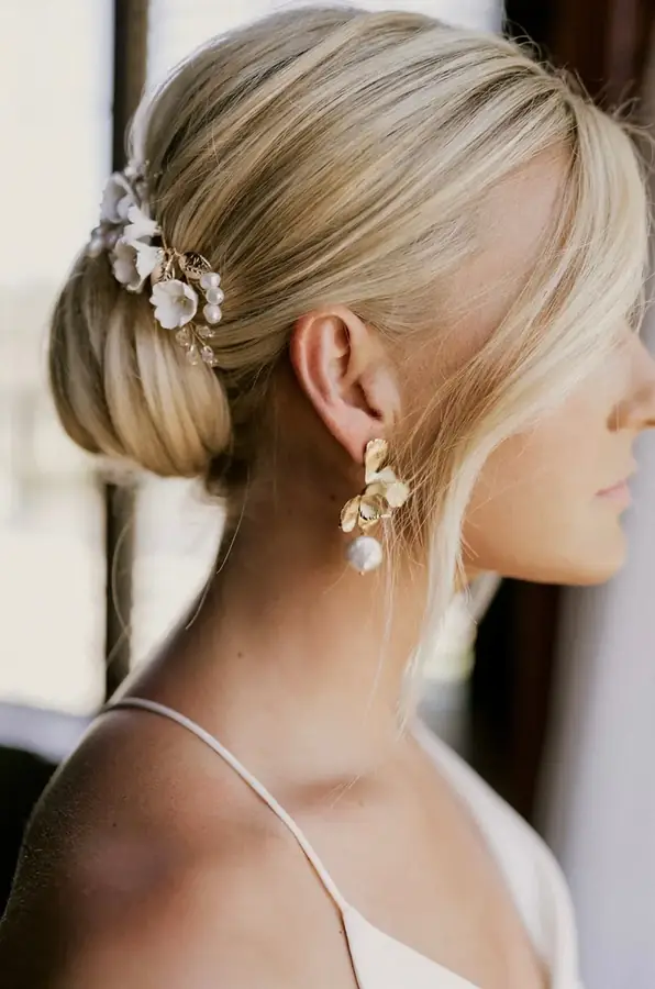
VIII — Last dance
Where we work
Hair & makeup artistry — over fifteen years
Beyond the hero
A hero alone will not read as Ritz-Carlton. What makes the register hold is a small set of repeated moves applied consistently — restraint in the palette, ceremony in the typography, and photographs that are never asked to be wallpaper.
On arrival, the house mark draws itself — the gold italic A in its hairline roundel, two rules extending from either side, the wordmark settling underneath. Then the plate arrives. About two and a half seconds. It is the job the film was doing, done with typography and no footage: a sense that you have been received rather than advertised to. Shown live at the top of Direction I.
A portrait-only library cannot fill a 16:9 screen without decapitating the subject. The formal answer is the one galleries and hotel corridors have always used: give the photograph a mat, a hairline keyline, and air around it. It reads as more expensive than full-bleed, and it is the only presentation that shows the work whole.
I, II, III instead of 01, 02, 03. Numbers as a folio rather than a dashboard. Applied to the process steps, the portfolio, and the plates, it does more for the register than any amount of gold.
The cities set as an engraved column between hairlines, centred, in Cormorant. Port Royal is a place; naming places — rather than listing "service areas" — is the single cheapest way to sound like an institution instead of a vendor.
Direction III. A pinned headline while a rail of matted plates pans sideways as you scroll. You walk the corridor rather than scrolling past a grid. It replaces the film's movement with movement that means something — travel through a collection.
Where the site wants motion, drift the whole framed plate slowly against the ground — never zoom inside the frame. Zooming is what made the old build feel like a detail crop; a plate that moves as an object keeps its subject intact.
The strongest possible page here has no photograph at all: ivory ground, the house mark, a single line of Cormorant, the cities, the CTA. Engraved-stationery minimalism. Worth seeing as a fourth direction if the owner is willing to trust restraint over imagery.
The live preview is minified build output with no source project, so the hero component cannot be edited directly. Two clean routes:
index.html — the video is hidden and the matted plate renders over
it. Reversible in one commit, no bundle surgery.src/pages/Home.tsx lines 77–96, where the hero actually lives, then the nav and
portfolio to match.
See the current site with the film →
Direction one, for comparison →
Every crop figure on this page was measured in a real browser at 1440, 1920 and 390 pixels wide, not estimated. Every plate below renders at its photograph's own aspect ratio, so the measured crop is 0% at all three widths.